 Super Easy Introduction to Excel Sunburst Charts Tutorial.
Excel Hierarchical Sunburst Charts, One Tier, Two Tiers and Three Tiers.
 The Sunburst Chart is one of the most overlooked chart options in Excel. It is however incredibly useful when you need, for instance a visual representation of where your business strengths are over time. Whether you need to quickly identify your best sales people, or the best sellers in your stock inventory, the Sunburst Chart gives an impactful visual representation of what comes out on top, whilst pushing the lower performers to the back of the queue.
On the inverse side, Excel's Sunburst Chart can aso be quickly used to see where your greatest areas of waste or expense are, whilst pushing your lower-end overheads back into obscurity.
In this tutorial we are going to create three Sunburst Charts
Lesson 1) A simple one tier Sunburst Chart showing name and quantity in one segment.
Lesson 2) Two tiered Sunburst Chart showing name, month and quantity.
Lesson 3) Three tiered Sunburst Chart showing name, month, weeks and quantity.
At the end of each lesson there is a video demonstrating the full process of creating the Sunburst chart.
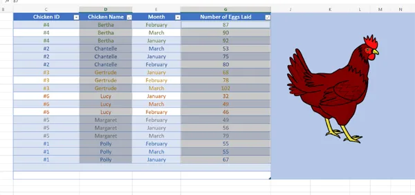
For the purposes of this tutorial we have extended the datasets used in our 'Super Easy VLOOKUP lesson', to examine the egg laying performance of our six chickens over the first quarter of the year (January to March).
Where can I get Training in Excel?
There are plenty of different ways to get training in Excel. If you're comfortable with self learning then there is a wealth of free Excel learning material available Online such as this VLOOKUP tutorial, plus an almost endless amount of free video Excel learning available on platforms such as YouTube. If you would prefer to be taught by an instructor then you can choose public courses at a training centre, or even local colleges (depending upon their monthly and seasonal training calendars). You could even have a trainer come out to your workplace for an on-site course. But if none of these options is right for you then you can also opt for virtual classroom Excel courses whereby you can attend from anywhere and still get the same great learning outcomes.
Lesson 1) Simple One-Tier Sunburst Chart Taking Data from just two Columns.
Selecting the Data:
We are going to select data from just two columns for this super simple Sunburst Chart ('Chicken Name' and 'Number of Eggs Laid').
From these two datasets we will create a single tiered Sunburst Chart which quickly visualises how our chickens performed between January and March.
Once we have selected our raw data, we are going to create our chart. Go to the 'Insert' tab and then the Chart dropdown down box which shows up the extended list of chart types available.
You will find the Sunburst Chart at the bottom under 'Other' (the fourth one along).
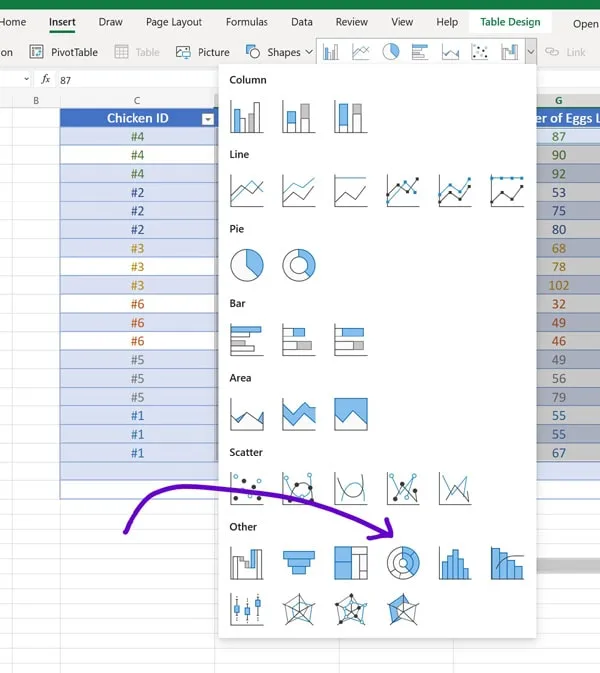
When we click on the Sunburst Chart, our basic single tier chart is automatically generated in an unedited state.
Our next task is to move the chart to somewhere more suitable (using drag and drop) and to re-size the chart. You can see this in action in the video demonstration at the end of this lesson.
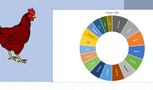
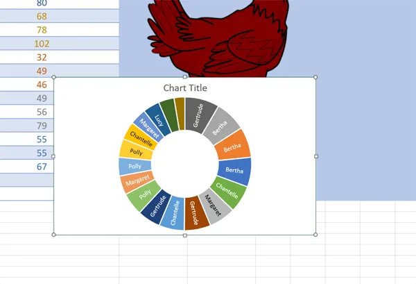
You can see that once the Sunburst Chart has been resized all of the text in there becomes visible.
Our next task is to format our Sunburst Chart.
Double click on the chart to reveal the formatting options.

The main Format menu gives us just two options to edit: Chart Title and Series 1.
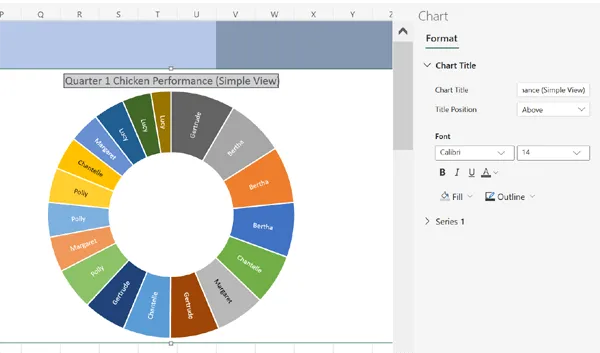
Formatting the Chart Title
Starting with the Chart Title we are going to rename our chart, 'Quarter 1 Chicken Performance (Simple View)'.
Click on the Chart Title and rename it in the edit box. In this instance we also gave the Title a Fill colour and an Outline colour and left everything else unchanged.
Formatting the Series
Now we are going to edit the Series. Click on the Series 1 forward arrow to reveal the options.
We don't want to change the Series Name or the Fill in this instance, but we can change the Outline which will add a colour between the segments of our chart.
Sunburst Chart Series Outline Editing
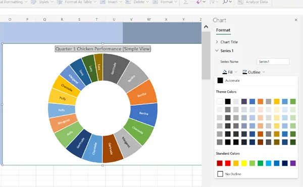
Sunburst Chart Series Outline Edited
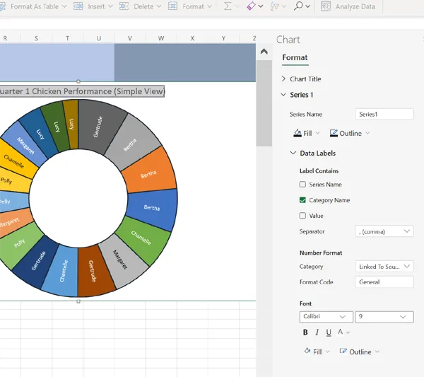
Formatting Data Labels
Now, click on Data Labels, which is a subheading of Series 1. There are a lot more options here.
You can see that within the Data Label Menu there are three checkboxs: Series Name, Category Name and Value.
In this example, the most important thing to do is to select the checkbox for Value so that information from both columns of data is shown in our single tier Sunburst Chart.
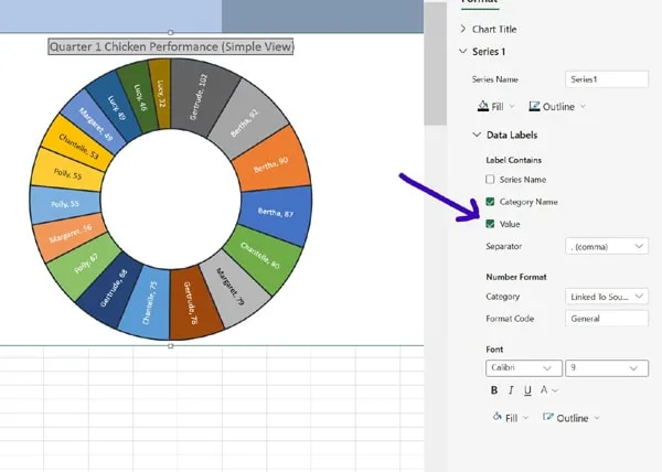
You can see that when we select the Value checkbox the numeric value for the number of eggs each chicken produced in a month appears in our chart. This is how we get two columns of Excel data to appear in a single tier Sunburst Chart.
Data Label Custom Separators
Next we want to change the way the Chickens' names and the number of eggs laid are separated. By default they're separated by a comma. We are going to use the Separator edit box to alter this. Click on the Separator dropdown to see the options. We are going to select the bottom option Custom and type the following: ' :'
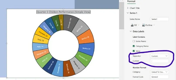
When we hit enter, this creates a new Separator in our Sunburst Chart layout which you can see in the image above whereby the default comma has been replaced by a colon and a space.
That pretty much concludes Lesson 1 in which we created our super simple single tiered Excel Sunburst Chart.
Watch the video below to see it in action.
Excel Sunburst Chart Single Tier (video length: 2 mins and 2 seconds)
What is remarkable about this simple one tier Sunburst Chart is the sheer volume of information that we can see at a glance.
For instance, we can see immediately that Bertha is our most consistent high-yield chicken, and that Margaret and Chantelle's performance is highly variable month-by-month. We can also ascertain that Polly and Lucy have fairly consistent low yields. It is also quickly apparent that Gertrude had one incredibly good month and two average months.
This is the sort of information that we can start to act on to make improvements around the farm.
What makes the two column, single tier Sunburst Chart so effective is that it renders this level of information immediately obvious.
Usually, a Sunburst Chart is recommended when you have more than two columns of data. This enables the Sunburst Chart to visualise a hierarchy, such as in an instance where we have say one column of data which represents months, a column of data for the chickens' names and one for the number of eggs laid each month. We will look at this in lesson two.
Tip: If your Sunburst Chart doesn't display quite as you want try rearranging the columns (whilst keeping your numeric data in the far right column). You can also try custom sorting your data, which we will also explore in the next lesson.
We come to you: Our regional Microsoft Excel trainers cover most locations of mainland UK for on-site visits including the English regions of the North West, North East, Yorkshire and the Humber, Greater London, the East of England, West Midlands, East Midlands, and also some parts of the South West of England (including Wiltshire, Bristol area and Gloucestershire) and South East of England (including Buckinghamshire, Oxfordshire, Berkshire, Hampshire and Surrey). Virtual classroom courses are available from anywhere via live video conferencing.
We really ❤ helping organisations to master Microsoft 365 and Adobe Creative Cloud. Our only question is: Will it be yours?
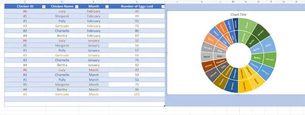
Lesson 2: Two tiered Sunburst Chart showing name, month and quantity.
In this second part of this introduction to Sunburst Charts we will follow up by showing you how to create a two-layered hierarchical Sunburst Chart using three columns of data. This introduces the concept of hierarchy.
In order to create a hierarchical chart from 3 columns of data, we will need to look at data sorting in order to take control of which columns of data are prioritised in our charts and whether they're sorted in ascending or descending order.
In the Excel spreadsheet in the image below the data has been sorted firstly by Month (in alphabetical order ascending) and secondly by 'Number of Eggs Laid' in ascending order for each month. When we create our chart from this then the months are prioritised to sort from the best month through to the worst month going clockwise.
The above chart is useful, but what if we wanted to prioritise the best performing chicken, rather than the best performing month?
For this we need to look at data sorting using a Custom Sort.
Custom Sorting Data in Excel
We are going to amend the way our data is displayed using a Custom Sort so that the Chicken Names are prioritised to start with the best performing chickens going clockwise through to the worst performing chickens.
In order to do this, first select all three columns of data and click on your right mouse button, as shown in the image below.
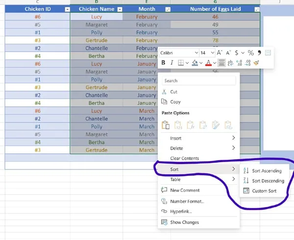
Go to Sort and then select Custom Sort. This will open the Custom Sort dialog box.
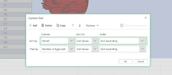
We are going to change the primary sort criteria from 'Month' to 'Chicken Name' and click OK.
Now we can create our Sunburst chart with the Chicken Names prioritised in the Sort.
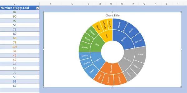
We can see that the chart now starts with the best performing Chicken (Bertha) and her best performing Month (January), working clockwise all the way to the worst performing chicken (Lucy) and her worst performing Month (January).
Tip: You will usually want to experiment with custom data sorting to discover which configuration best suits your own specific datasets when creating charts from your raw data.
To format your first hierarchical Sunburst Chart in Excel follow the procedures that we used in Lesson 1.
You can see the complete process for creating our hierarchical Sunburst Chart in the video below:
Excel Sunburst Chart Hierarchical Two Tier (video length: 2 mins and 37 seconds)
You will notice that in this instance, we didn't add a custom separator between the Month and the number of eggs laid, but don't worry, you can revist the instructions for custom separators in Part 1 for this or you can see the custom separator in action in our video in Part three (The Three Tier Hierarchical Sunburst Chart).
Lesson 3: Three Tier Hierarchical Excel Sunburst Chart
Now that we have seen the two tier Sunburst chart in action, we're going to create a three tier version which uses four columns of Excel data.
This time we are going to make it more interesting by only having partial data in the fourth tier.
In order to get started we have added a new column of data which breaks down the month of January into weeks for Bertha. Since she laid so many eggs in January we want to look at how she did on each week. Notice that in order to do this we also had to insert four new rows to accommodate the hierarchical shift between weeks and months.
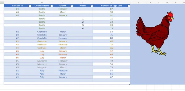
We should take some time to break down this table now to explore why it is going to work as a three tier chart.
The first rule that we have followed is to keep our numerical data ('Number of Eggs Laid') on the right.
The second thing we have done is to use the four inserted rows to put our figures for eggs laid per week into the same column as the figures for eggs laid per month.
We have also purposely left the column for weeks empty, except for the four weeks in January that we are interested in highlighting.
Now let's create our Sunburst Chart using the same method that we have learnt in Lesson 1 of this tutorial (INSERT > CHART DROPDOWN BOX > SUNBURST CHART).
This is our raw, unedited three tier Sunburst Chart:
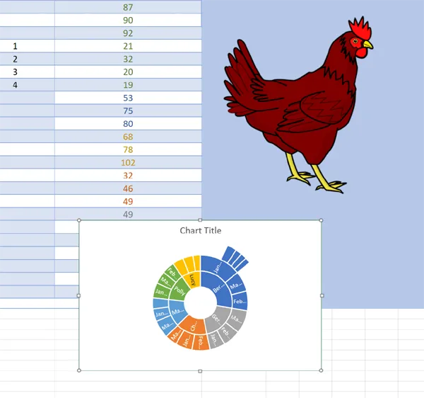
As you can see, the four weeks that we wanted to highlight now stick out like bicycle spokes as the third tier of our Sunburst Chart.
At the default size, however, the chart doesn't really show us that much information. So our first job is to resize the chart to get a better look.
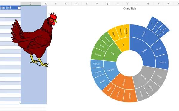
Once we have resized our Sunburst Chart we can see more information; such as that Bertha's best week in January was on Week 2 and her worst week was in Week 4 (Remember in Lesson 2 that we custom sorted our 'Number of Eggs Laid' data in ascending order, so that the weeks don't appear as weeks 1 to 4, but in order of the number of eggs laid).
Finally we need to format our three tier Sunburst Chart which, since we learnt how to do this in Lesson 1, we will just demonstrate in the final video of the tutorial:
Excel Sunburst Chart Hierarchical Three Tier (video length: 2 mins and 24 seconds)
If you want to learn more about Excel's Sunburst Chart ask us about our Excel training courses.
If you enjoyed this tutorial you might also like:
- 17 Excel Functions for Absolute Beginners
- DateDif() the Hidden Excel Function that You Should Know About
- Excel XLOOKUP Function Tutorial (with fun examples)
- The Best Places to Teach Yourself the Excel LAMBDA Function
- How do I translate Excel Functions into other Languages?
- Create a Simple Excel VLOOKUP in Under 2 mins
- Concise Guide to Excel Shortcut Keys
- The Excel CONVERT Function Conversion Toolkit
- How Long Does it Take to Learn Excel?
We really ❤ helping organisations to master Microsoft 365 and Adobe Creative Cloud. Our only question is: Will it be yours?

Our Excel Trainers are:
Inspirational subject experts with a wealth of experience, proven track records and excellent feedback.
Our Closed Excel Courses are:
Flexible instructor-led courses catering to YOUR specific learning needs and training requirements.
Education is Our Passion:
Over 35,000 students trained across almost every industry, sector and background.
Back to top
 Excel Training Reviews
An excellent, clear and patient tutor who guided me through the course seamlessly.
M Menzies (Online Excel training 365 (virtual classroom))
Can I just pass on my thanks to your team for the training you provided in York. I've had lots of positive feedback from the staff involved.
J Whiley, NHS York and Selby (Excel training York)
Really useful. Really knowledgeable trainer.
A Ward, Aeromet (Advanced Excel Training Worcester)
The trainer explained everything really well. I found the course easy to follow.
V Broxham, Baywa-re Operational Services (Intermediate Excel training Milton Keynes)
Happy with everything.
M Aston, Bierce Surveying Ltd (Advanced Excel Training Aylesbury Buckinghamshire)
We have had a few people over the years but the way the trainer picked up our business and requirements so quickly – all I can is you have a diamond there.
S Jenkins, Concorde Glass (Intermediate Excel Training Grimsby)
We all thoroughly enjoyed the course, we learned a great deal and thought Sara was a brilliant trainer, very patient with a fantastic way of teaching us, so thank you for that.
C Waldock, Darlington Borough Council (Intermediate Excel training Darlington, County Durham)
☆ ☆ ☆ ☆ ☆ Five Star Review
We had some really great feedback from the last two training sessions,
on the quality of the content as well as the delivery from the trainer.
Excel Training London
The content covered the exact content required after the beginners course. The information will allow me to improve the spreadsheets currently in use.
L Powell, Dudley Building Society (Intermediate Excel Training Dudley)
Great course!
V Franklin, E-Leather (Excel Beginners Training Peterborough)
The training approach and style was great. Incredibly informative and supportive.
L Shier, One YMCA (Introduction to Excel Training Watford, Hertfordshire)
Great teacher!
J Smith, Fisher German (Intermediate Excel Training Canterbury, Kent)
Its an excellent course. I was impressed by the discovery of so many tools that will facilitate our working life. The trainer is excellent, everything was perfect.
S Green, HW Martin (Beginners Excel Training Cambridgeshire)
Very happy to learn so much.
O Chawishly, LM Information Delivery (Intermediate Excel Training Oxfordshire)
Covered all objectives. Wish We'd had two days.
B Hough, Homebase (VBA for Excel Training Milton Keynes)
The course was excellent, covering more in a single day of training than I anticipated would be possible with a high degree of clarity.
Unsigned, New Economy, (VBA for Excel Training Manchester)
Very informative, easy to follow. Trainer was clear with his explanations
S Nottingham, Denney O'Hara (Microsoft Excel training Leeds, West Yorkshire)
Excellent day!
L McLachlan, Grange School (Excel training Rochdale, Greater Manchester)
Brilliant Training, went at the right speed [and] was made relevant to work
Kathryn Strong, Tennants Distribution (Excel training Manchester)
Fantastic course, not too much information overload. Explained simple. Exactly what I needed. Many thanks.
K Stobbs, Depuy Spine - A Jonson and Jonson Company (Introductory Excel training Leeds, West Yorkshire)
The flexibility of the course was ideal.
S Walsh, Progress Rail (Advanced Excel training Edinburgh, Midlothian)
The guys who came to the course this week were very impressed with the whole set up and are now eager to attend the next level up.
E Dixon, Connaught PLC (Beginners Excel training Leeds, West Yorkshire)
The course has improved my knowledge of Microsoft Excel and was a good pace so easily understandable. Gerry was very patient and helped each of us where we needed it.
L Muir, Filtronic Broadband (Microsoft Excel training Newcastle Upon Tyne)
Although a total beginner on Excel, I found the course to be extremely helpful.
S Antonie, Filtronic (Excel training Shipley)
Made what I thought was going to be completely foreign to me easy to understand. I can actually see where I can use Excel in my day job now. Max was very good and took the time to make sure we understood. [...] Nothing could be improved.
C Elsmore, Elmwood Design (Excel training Leeds, West Yorkshire)
Very Useful.
J Collins, Cooper Research Technology Ltd (Advanced MS Excel Training Ripley, Derbyshire)
Enjoyable and informative.
N. Bell, Cosalt PLC (Excel advanced training Grimsby, Lincolnshire)
The training session went very well and I have had a lot of good feedback from the participants.
P Ogden, InterfaceFLOR (Microsoft Excel Training Halifax West Yorkshire)
Course exceeded expectations.
K. Richards, Ashfield Homes (Microsoft Excel Training Sutton-in-Ashfield, Nottinghamshire)
The day was very well constructed and presented.
D. Coulthand, Crossgates Shopping Centre, Leeds (Intermediate Microsoft Excel Training Leeds, West Yorkshire)
Training very clear. Never felt rushed or pressured to complete tasks. Each item explained and demonstrated very well. Easy to follow
S. Hope, Lear Corporation (Advanced Microsoft Excel Training Coventry, West Midlands)
Good course, good information, good trainer and at a nice tempo
A. Webster, BE Aerospace (Advanced Microsoft Excel Training Hinckley, Leicestershire)
Excellent, the best Excel course I have ever been on. Trainer gave time and patience to us all.
D. Gill, Persimmon Homes (Beginners Microsoft Excel Training Malmesbury, Wiltshire)
A very robust day's training.
T. Camp, Ideal Shopping (Beginners Microsoft Excel Training Peterborough, Cambridgeshire)
The course in Edinburgh was incredible
C. Rowley (Beginners Microsoft Excel Training Edinburgh, Midlothian)
☆ ☆ ☆ ☆ ☆ Five Star Review
Thank You. We got very good feedback from all who
attended the beginners course last week.
Virtual Classroom Excel Training Glasgow
MS Excel Course Levels:
- Beginners Excel
- - introductory topics for working with Excel spreadsheets
- Intermediate Excel
- - conditional formatting, VLOOKUP, IF, apply formulas across worksheets, database features, security and conditional formatting etc.
- Advanced Excel
- - What-If Analysis, PivotTables, PivotCharts, Goal Seek, Sparklines, protecting workbooks, formula auditing etc.
- Masterclass Excel
- - 'zero to hero' three-day intensive Excel course
- Excel for VBA beginners
- - one or two day introduction to programming with VBA
- Excel Power Query course
- - Introduction to using Excel Power Query along with Pivot Tables, Power Pivot and Power Pivot Measures
- Copilot Integration with Microsoft Excel for Power Users course
- - Enterprise Microsoft Excel course to accelerate data analysis, automation and reporting using Copilot's native Excel integrations
To book a training course simply call 0844 493 3699, or email info@foursquaretraining.co.uk